As an Amazon Associate, we earn from qualifying purchases. Some links on this site are affiliate links at no extra cost to you. Our recommendations are based on thorough research and editorial judgment.
Matching Shade Sails to Patio Furniture Colors
Analyze your patio furniture’s color—determine whether it’s neutral, metal, or wicker—and select shade sail hues accordingly, using complementary or analogous colors for visual balance. Apply the 60-30-10 rule to distribute dominant, secondary, and accent colors, ensuring harmony. Confirm fabric’s UV resistance and durability, test colors under natural light at installation sites, and consider seasonal color trends to match ambiance. Measure patio space precisely for proper coverage, then evaluate heat absorption impacts. Follow these steps to optimize cohesive outdoor aesthetics and uncover advanced matching strategies.
Key Takeaways
- Use complementary colors like blue sails with orange furniture to create vibrant, dynamic outdoor spaces.
- For neutral furniture, choose earthy or bold shade sails to balance subtlety with contrast.
- Match monochromatic shade sails with furniture in similar hues for cohesive, elegant aesthetics.
- Consider seasonal color trends and outdoor lighting to enhance ambiance and color harmony.
- Test fabric samples in natural light to ensure color accuracy and durability with patio surroundings.
Understanding Color Theory for Outdoor Spaces
You may be interested

Begin by familiarizing yourself with basic color theory principles, including primary, secondary, and tertiary colors, to create harmonious outdoor palettes. Apply color psychology by selecting colors that evoke desired moods, such as blue for calmness or yellow for cheerfulness. Develop color harmony by pairing complementary colors—opposites on the color wheel—for dynamic contrast, like blue shade sails with orange furniture. Alternatively, use analogous colors positioned adjacent on the wheel to produce serene, cohesive looks, such as green shade sails matched with teal seating. Implement the 60-30-10 rule to balance dominant colors (shade sails), secondary hues (furniture), and accents (cushions or plants). Follow these structured guidelines precisely to achieve visually appealing, psychologically appropriate outdoor spaces that enhance user experience while maintaining professional design standards. Additionally, regular inspection and maintenance are essential to ensure the longevity and vibrancy of your outdoor materials, similar to the upkeep required for pool equipment like pool vacuum maintenance.
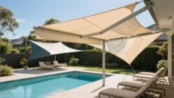
Selecting Shade Sail Colors for Neutral Furniture
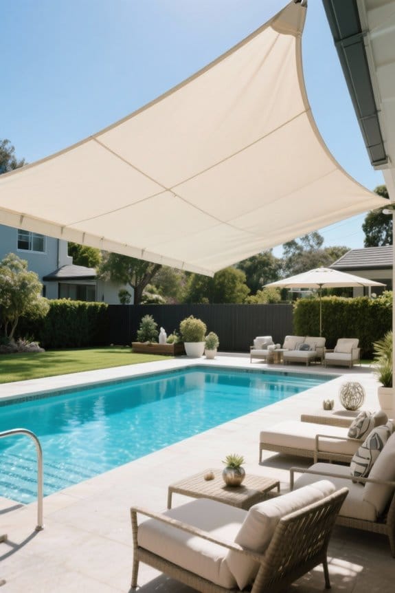
Shift focus to selecting shade sail colors that enhance neutral-colored furniture, optimizing visual balance and ambiance. Choose earthy tones like taupe or soft gray for cohesive color combinations that blend seamlessly with existing palettes. Introduce bold colors such as deep navy to create impactful contrasts without clashing. Incorporate light shades, including pastels or white, to brighten the patio and maintain an airy atmosphere. Assess seasonal considerations by selecting warmer hues for cozy autumnal settings and cooler shades for calming summer environments. Utilize textured or patterned sails to increase visual interest while preserving harmony with neutral furniture. Prioritize the intended ambiance: warmer shades promote comfort, while cooler tones encourage relaxation. Follow these guidelines to balance aesthetics and function, ensuring shade sails complement neutral furniture effectively. Additionally, selecting sails made from high-density polyethylene enhances durability and maintains UV protection while achieving the desired color effect.
Recommended Products
【UV RAY PROTECTION】Utilizing 200 GSM HDPE material, this shade sail blocks 95% of sun rays effectively. It offers a safer environment for your family while preventing patio furniture from fading out.

【𝗛𝗘𝗔𝗩𝗬 𝗗𝗨𝗧𝗬】: our super ring shade sail exact 260 GSM permeable extra fabric, stainless mounting super rings, edges with cable wires built-in, integrate into the mounting rings, all pulling strength goes to the cable wires, making the edges more durable

【𝗘𝗡𝗛𝗔𝗡𝗖𝗘𝗗 𝟵𝟱% 𝗦𝗨𝗡 𝗣𝗥𝗢𝗧𝗘𝗖𝗧𝗜𝗢𝗡 】: Crafted from durable 200 GSM HDPE material, our shade sail provides reliable protection against harmful UV rays, blocking up to 95% of them for a safer outdoor experience.
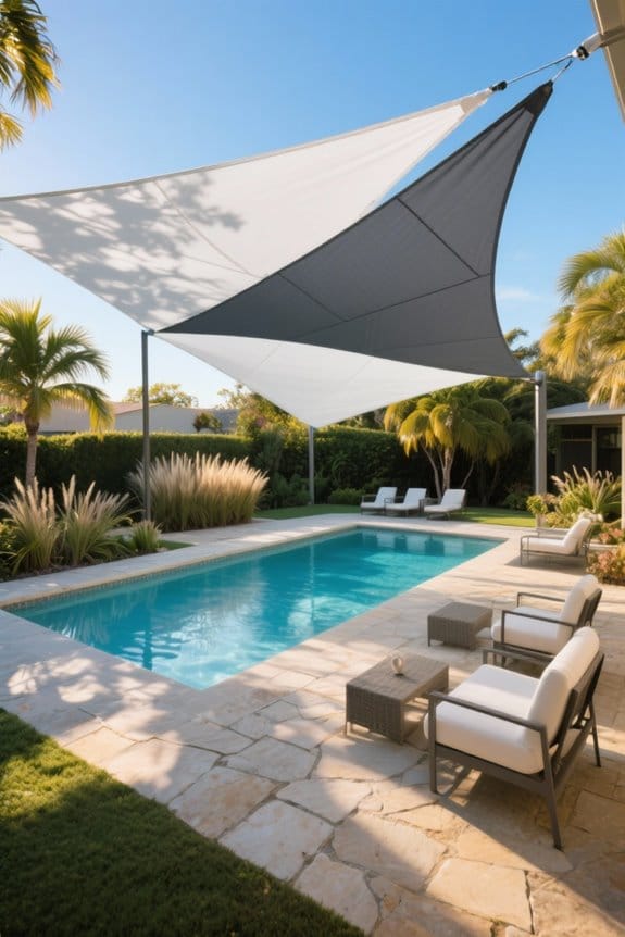
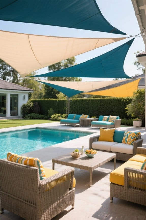
Complementary Colors to Bright Patio Furniture
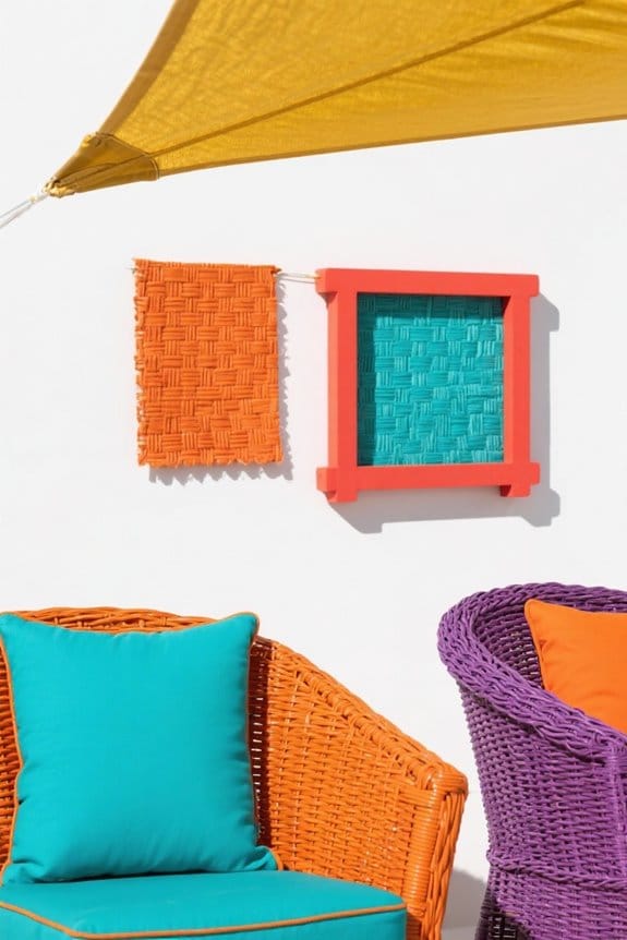
Although vibrant patio furniture commands attention, carefully select shade sail colors that complement without overwhelming. Choose deep blues or greens to produce bold contrasts, enhancing the furniture’s vibrant edges and preventing visual clash. Apply neutral tones like beige or light gray to balance intensity, preserving a cohesive outdoor atmosphere. Incorporate earthy shades, such as terracotta or olive, to harmonize brightness with natural surroundings. Avoid overly saturated hues that compete for attention. Install shade sails with geometric patterns when using bold furniture to add depth and visual interest, supporting a modern aesthetic. Focus on precise color matching by sampling paint swatches against furniture fabric in natural daylight, adjusting selections accordingly. This method guarantees effective integration, maintaining the vibrancy of bright patio pieces while providing functional shade. Additionally, consider the shade sail’s UV blockage capabilities to ensure lasting protection and comfort.
Recommended Products

Commercial Grade Quality: Uv-protected high-density polyethylene, 100% virgin material. Shade fabric with strong stitched seam and durable stainless steel A-rings in each corner and cable wires built-in edges. Integrate into the mounting rings, all pulling strength goes to the cable wires, making the edges more durable.

Premium Material: Our sun shade sail is made of 260 GSM high density polyethylene fabric. The fabric design effectively blocks direct sunlight and UV rays, while its breathable properties promote air circulation, enhancing comfort in outdoor environments.

HIGH QUALITY MATERIAL - Our rectangle sun shade sail is made of 260GSM high-density polyethylene, finished with the strong stitching seam and double webbing. It is durable and fade-resistant, but not waterproof.
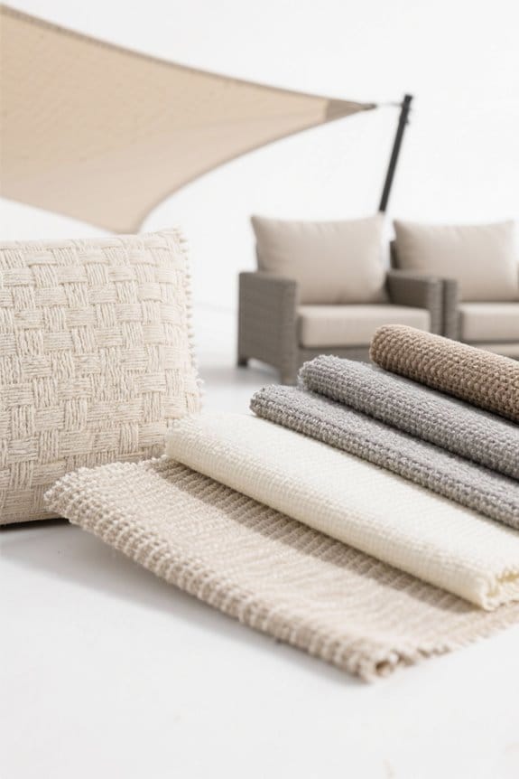
Using Monochromatic Schemes With Shade Sails
Extend color coordination by employing a monochromatic scheme to unify shade sails and patio furniture seamlessly. Select shade sails in lighter or darker versions of the furniture’s primary color to guarantee effective color blending, enhancing depth and visual interest. Combine solid-colored shade sails with patterned or textured patio furniture within the same hue family to maintain monochromatic sophistication while preventing monotony. Use fabrics with similar tones to reinforce cohesiveness, and strategically place greenery or minimal decorative accents to complement the scheme without disrupting balance. Focus on consistent undertones when matching shades, avoiding clashing intensities. Monitor sunlight exposure and fabric fade resistance when selecting sail materials to preserve color fidelity. Follow installation guidelines carefully, securing sails at measured angles to optimize shading and aesthetic harmony within the monochromatic palette. For best results, maintain consistent monitoring similar to how pool owners use regular testing frequency to ensure lasting quality and appearance.
Recommended Products

【𝗦𝗨𝗣𝗘𝗥 𝗛𝗘𝗔𝗩𝗬 𝗗𝗨𝗧𝗬 𝗡𝗘𝗪 𝗣𝗔𝗧𝗘𝗡𝗧 𝗗𝗘𝗦𝗜𝗚𝗡】: Made of 260 GSM permeable extra heavy duty fabric, heavy duty stainless mounting rings, cable wires built-in edges, integrate into the mounting rings, all pulling strength goes to the cable wires, not only making the edges more durable, it also enhence the appearance of shade sail.

【VIRGIN UV STABILIZED HDPE – LONGER LASTING】Artpuch shade sails are made from 190 GSM 100% virgin (non-recycled) HDPE material, treated with UV stabilized compound. Laboratory testing of 20,000 hours shows this fabric is 70% more durable under sun exposure than recycled HDPE. It resists drying out, tearing, and fading, which significantly extends the lifespan of your shade sail.

【𝗦𝗨𝗣𝗘𝗥 𝗛𝗘𝗔𝗩𝗬 𝗗𝗨𝗧𝗬 𝗡𝗘𝗪 𝗣𝗥𝗢 𝗥𝗜𝗡𝗚】: Crafted from 260 GSM permeable heavy-duty fabric, featuring upgraded 2025 stainless steel mounting rings and integrated heavy-duty steel cables along the edges. This design channels all pulling forces through the steel cables, enhancing edge durability and improving the overall aesthetics of the shade sail
Incorporating Patterns and Textures in Shade Sails
Incorporate patterned or textured shade sails by first evaluating the patio’s style, then selecting geometric designs for modern settings or floral motifs for traditional ones. Focus on pattern selection that complements existing furniture; use large-scale patterns in open spaces, smaller prints in compact areas. Explore texture options such as woven or ripstop fabrics, which add depth while maintaining durability and sun protection. Match color schemes by pairing neutral-patterned sails with vibrant chairs to balance the palette. Measure patio dimensions precisely before installation to guarantee the patterned sail fits proportionately without overwhelming other elements. Use tensioning equipment like turnbuckles and snap hooks for secure fitting, checking fabric tension to prevent sagging. Regularly inspect textured surfaces for wear and clean according to fabric guidelines to maintain appearance and function. Additionally, selecting materials with UV stabilization similar to those used in UV-stabilized, corrosion-resistant pool ladders can enhance the fabric’s longevity and resistance to sun damage.
Matching Shade Sails With Wooden Furniture Tones
Wood tones greatly influence shade sail selection, so begin by identifying the furniture’s exact hue, such as light birch, walnut, or mahogany. Assess wood tone considerations carefully, noting undertones and saturation to guide color choice effectively. Select neutral shade sails like beige or soft grey for versatile compatibility across finishes. For matte-finished wood, prioritize muted sail colors that blend subtly, avoiding overpowering contrasts. When working with glossy finishes, introduce brighter shades like deep navy or burgundy to emphasize wood grain. Incorporate earthy tones such as olive green or terracotta to enhance natural patio aesthetics. Verify finish compatibility to confirm cohesive visual harmony, testing fabric swatches against furniture if possible. Maintain balance by either matching the sail closely to wood undertones or applying strategic contrast for an elegant outdoor environment. Additionally, consider selecting fabrics made from High-Density Polyethylene for their durability and excellent UV protection when exposed to outdoor elements.
Recommended Products

Super Heavy-Duty Commercial Grade Design: Crafted from 280GSM extra-heavy-duty permeable fabric and reinforced with stainless steel mounting rings. The patented Artpuch design integrates steel cables into the edges, directing all pulling tension to the cables—enhancing both durability and appearance for commercial and residential use.

★ U-SHAPED DESIGN: With unique U-shaped design, it can be easily pull back when you don’t need the shade. You can determine the distance between the sections with control tape and close it when not in use. It is also a stylish decoration for your patio or pergola.

Super Heavy Duty Commercial Grade Design: Crafted from 280 GSM permeable extra heavy-duty fabric and reinforced with stainless steel mounting rings, KANAGAWA patented design integrates cable wires into the edges. This ensures all pulling strength is directed to the cable wires, enhancing both durability and appearance, making it ideal for commercial and residential use
Coordinating Shade Sails With Metal Patio Sets
When coordinating shade sails with metal patio sets, begin by identifying the metal’s finish, such as brushed aluminum, powder-coated steel, or wrought iron. Select color choices that complement the finish—navy or charcoal enhance modern aluminum, while earthy tones suit bronze or wrought iron. Use contrasting colors to add visual interest, but maintain design balance to avoid overwhelming the space. Match shade sail fabric with the outdoor theme: choose solid colors for minimalist metal sets, patterned sails for eclectic designs. Confirm UV resistance to protect metal finishes and furniture from fading. Test fabric samples in natural light to observe true color and guarantee harmony with the metal’s finish and surrounding decor. Follow these steps carefully to achieve a cohesive and well-balanced patio environment. Additionally, selecting shade sails made of high-density polyethylene (HDPE) improves airflow and reduces heat buildup, enhancing comfort around metal furniture.
Recommended Products

Durable & Heavy-Duty Material: Crafted from 120GSM high-density polyethylene (HDPE) with reinforced binding and grommets, this sun shade cloth offers exceptional durability for outdoor use. Its permeable design allows rainwater to pass through easily, preventing water accumulation and sagging. Resistant to tearing and mild weather, it provides reliable sun shade and light wind protection season after season

𝗖𝗢𝗟𝗢𝗥 & 𝗦𝗜𝗭𝗘: Classic Series Features a Gray Frame, Fabric Color: Canvas Umber (solid), Size: 13' Wide x 10' Projection Full Extension. Advaning Awnings are 100% Fully Pre-Assembled and Ready for Installation.

Wind-Resistant Protection: Pro-Tect tested and proven to withstand up to 100 mph winds*
Choosing Shade Sails for Wicker and Rattan Furniture
Select shade sails for wicker and rattan furniture by prioritizing earthy tones such as taupe, beige, or olive green, which harmonize with the natural textures. Use natural color palettes to maintain cohesion and avoid visual clutter. Measure the patio space accurately, choose UV-resistant fabric, and guarantee proper tensile strength for durability. Introduce vibrant contrasts by opting for teal or coral sails if aiming to highlight the furniture. Match sail colors to cushion or decor accents to unify the overall design. Install shade sails with stainless steel hardware, maintaining tension points to prevent sagging or flapping. Consider light-colored sails to enhance the airy, lightweight appearance of wicker. Regularly inspect for sun damage and clean fabric as recommended. This method secures both aesthetic appeal and functional protection for outdoor wicker and rattan settings. Additionally, selecting fabrics with UV-resistant, fade-tested materials will ensure long-lasting color and protection from sun damage.
Seasonal Color Trends for Patio Shade Sails
Match shade sail hues to seasonal color trends by consulting current interior design palettes for accurate guidance. Prioritize earthy tones like terracotta and sage green during spring and summer, reflecting nature-inspired themes. Incorporate bold colors such as deep blues and vibrant yellows to align with statement patio furniture pieces, enhancing visual impact. Reference Pantone hues annually to select trending shades, including past favorites like Living Coral and Very Peri, ensuring contemporary appeal. Opt for textured fabrics in warm neutrals and soft pastels for fall, providing subtle depth and complementing seasonal furniture arrangements. Choose sustainable materials finished in organic tones—bamboo and driftwood hues—to support environmentally-conscious choices and establish harmony with outdoor settings. Review fabric samples under natural light before purchase, confirm UV resistance properties, and verify dimensions precisely to achieve ideal coverage and color fidelity. Additionally, consider high-density polyethylene fabric for its UV protection and breathability, which enhances comfort and extends the shade sail’s lifespan.
Impact of Shade Sail Colors on Outdoor Ambiance
Although choosing shade sail colors might seem secondary, consider their profound impact on outdoor ambiance. Apply principles of color psychology to select hues that influence mood, such as blue or green to evoke calmness. Assess spatial perception by opting for lighter shades to create an airy, expansive feel, or darker tones for a cozy, intimate space. Account for heat absorption—dark shades increase temperature, while light colors reflect sunlight, maintaining cooler conditions. Select bold colors to add visual interest and define the patio area, but avoid overwhelming neutral furniture styles by integrating beige or grey sails for a seamless blend. Evaluate existing furniture colors, then match or contrast accordingly. This systematic approach guarantees shade sails optimize both aesthetic appeal and comfort in outdoor settings. Additionally, considering the UV protection ratings of shade sail fabrics ensures that color choices also contribute to effective sun blocking and durability.
Utilizing Accent Colors in Shade Sails
Incorporate shade sails that emphasize accent colors found within patio furniture upholstery to foster visual harmony. Identify dominant accent hues, then select shade sail materials capable of showcasing those tones vividly, such as solution-dyed acrylic or polyester. Apply accent color psychology to choose colors that evoke the desired mood while complementing existing furniture patterns. Opt for bold reds or deep blues, or use patterned fabrics incorporating multiple accent shades for cohesion. Verify fabric texture compatibility with your furniture’s surface to avoid design clashes, and confirm UV resistance ratings to maintain color integrity over time. Measure patio dimensions accurately—using tape measures and laser distance finders—to guarantee shade sails cover key areas without overwhelming accent colors. Adjust tensioning hardware placement to prevent fabric sagging, preserving the accent colors’ intended visual impact.
Tips for Testing Shade Sail Colors Outdoors
When should shade sail colors be evaluated outdoors to ascertain accurate selection? Perform fabric testing during multiple daylight periods—morning, noon, and late afternoon—to observe changes in shade under varying sun angles. Use a color swatch or sample, hold it adjacent to patio furniture, and compare directly in the outdoor space. Test against different backgrounds like grass, concrete, or plants to understand contextual influence on shade perception. Note how nearby colors impact the hue, as adjacent shades can alter visual accuracy. Always conduct fabric testing in the exact location of installation to guarantee complementary integration with the environment and furniture. Follow these steps carefully for precise shade selection, avoiding surprises post-installation, and achieving a harmonious patio aesthetic that adapts well to natural light fluctuations.
Frequently Asked Questions
What Is the Best Color for Shade Sails?
The best color for shade sails balances color psychology and design trends, favoring lighter shades to cool spaces or bold hues for vibrancy. Neutral or earthy tones offer timeless appeal, harmonizing with various outdoor environments effectively.
What Is the Disadvantage of a Shade Sail?
Shade sails act like delicate kites in strong winds, facing durability concerns such as tearing and fading. Additionally, installation challenges arise due to the need for sturdy anchor points, complicating setup and potentially increasing costs considerably.
What Is the Best Color for Sails?
The best color for shade sails aligns with current shade sail trends, favoring neutral or vibrant hues. Color psychology suggests calming blues or energizing reds, balancing aesthetics and comfort, while considering climate and visual impact for ideal outdoor experience.
What Is the Best Color Sunshade?
The best color sunshade is a balance; lighter hues deflect heat like mirrors, while darker ones absorb warmth. Durable shade sail materials and proper sunshade maintenance guarantee longevity despite fading risks under constant sunlight exposure.